
Your brand is more than a logo and color palette. The fonts on your direct booking site shape how guests perceive your property before they ever scroll to your listings.
Why Typography Matters for Direct Bookings
Before diving into the how-to, understand this: typography is one of the fastest ways to elevate your site from “template” to “brand.” The right font pairing creates visual hierarchy, builds trust, and guides guests toward your Book Now button. Generic fonts signal a generic experience. Custom typography signals intention.
The Result: A site that feels like yours — not a cookie-cutter listing page.
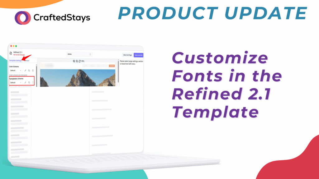
How to Customize Fonts in Refined 2.1
Step 1: Open the Typography Panel
- Log into your CraftedStays Dashboard.
- Navigate to Site > click Edit Template.
- Select Template Settings.
- Open the Typography section.
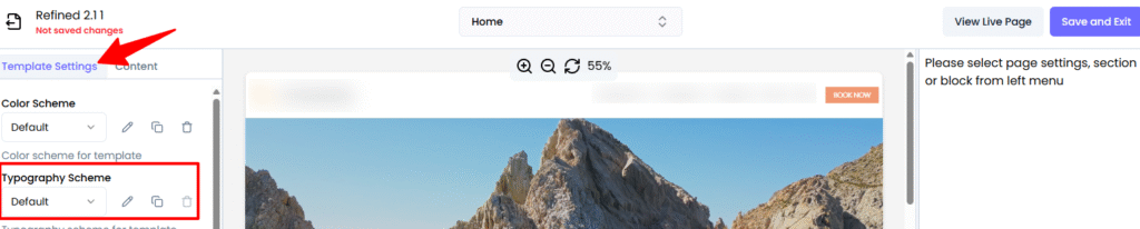
All global text styles are managed here, so changes apply across your entire site without editing each page individually.
Step 2: Understand the Default Font System
Refined 2.1 ships with a curated set of font families designed for clarity and hierarchy:
- Branch — Large display headings and primary titles. This is your statement font.
- Geograph Light — Body text and subtle elements. Clean, readable, professional.
- Geograph Medium — Subheadings and emphasis. Adds weight without overwhelming.
- Work Sans — Pricing, dates, and technical details. Mono-style for scannability.
All font sizes are based on a 16px root size with rem-based scaling, so your typography stays consistent and responsive across every device.
Step 3: Know What Each Text Style Controls
Here’s what you can customize and where each style appears on your site:
Headings:
- Heading (Display) — Hero headlines and major announcements (60px)
- H1 — Primary page and blog titles (48px)
- H2 — Major section headings (36px)
- H3 — Subsections and feature block headers (30px)
- H4 — Card titles, sidebar headings, FAQ questions (24px)
- H5 — Minor headings and list headers (20px)
- H6 — Smallest headings and labels (18px)
Body and UI Elements:
- Body text — Main paragraph text, blog content, descriptions (16px)
- Menu — Navigation items, tabs, links (16px)
- Small text — Dates, bylines, secondary information (14px)
- Caption — Image captions, helper text, footnotes (12px)
- Button — Primary and secondary call-to-action buttons (16px, semi-bold)
- Accent — Highlighted inline text and callouts (16px)
- Mono — Pricing, dates and times, IDs, technical snippets (14px)
Pro Strategy: You don’t need to change everything. Start with your headings and body text. Those two alone account for 90% of what guests read on your site.
Recommended Font Structures by Page Type
Blog Posts
- Title: H1 (Branch, bold)
- Subtitle/tagline: Heading (Display) or H2
- Meta info (author, date, reading time): Small text
- Main sections: H2 or H3
- Body content: Body text
- Image captions: Caption
- In-article CTAs: Button style for visibility
Landing and Campaign Pages
- Hero headline: Heading (Display)
- Hero subheading: H2 or Body text
- Section titles (feature blocks): H2
- Supporting copy: Body text
- CTAs (“BOOK NOW”, “SEARCH”): Button style with letter spacing
Best Practices When Changing Fonts
When you adjust typography, keep these guidelines in mind:
- Maintain hierarchy — Use your display font for headings and your body font for everything else. Guests should be able to scan your page in seconds.
- Preserve readability — Keep body text at or around 16px with a line height near 1.5 for longer-form content.
- Limit font variations — Resist the urge to introduce too many additional fonts. The curated families in Refined 2.1 are designed to work together.
- Check contrast — Use dark text on light backgrounds for body content. Ensure sufficient color contrast for accessibility.
- Think mobile-first — The rem-based system scales well, but always preview changes on smaller screens before publishing.
Tips for Hosts
- Match your typography to your brand personality — a luxury cabin brand might lean into elegant serif-style display fonts, while an adventure property could go bolder
- Keep button text action-oriented and easy to read at a glance
- Preview your site on mobile after any font change — over 50% of your guests are browsing on their phone
Note: Typography controls are currently available for websites using our Refined 2.1 template, with rollout to all templates coming soon.
Your brand deserves more than default fonts. CraftedStays gives you full control over typography, colors, and every detail of your direct booking site — no code, no agencies.